readlists
a fluid user interface
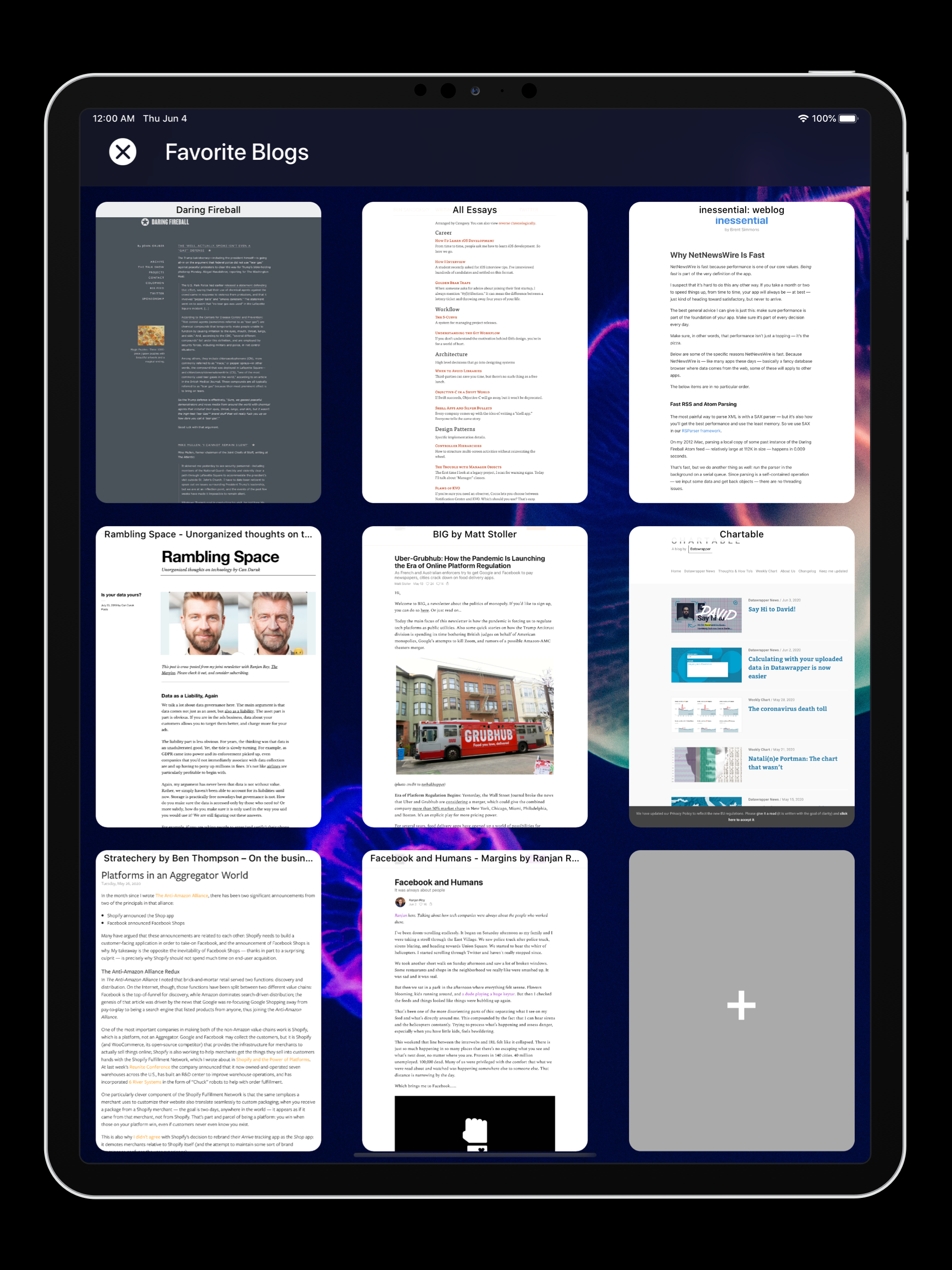
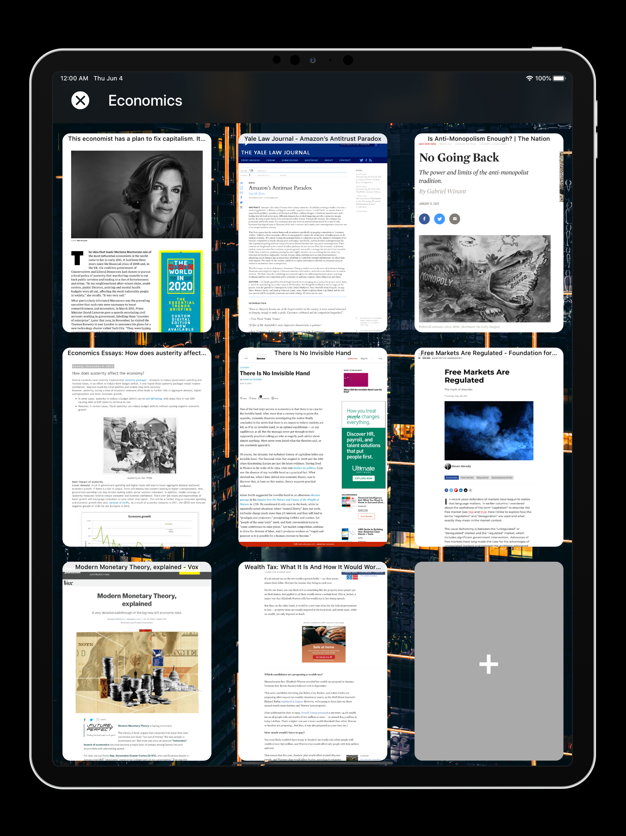
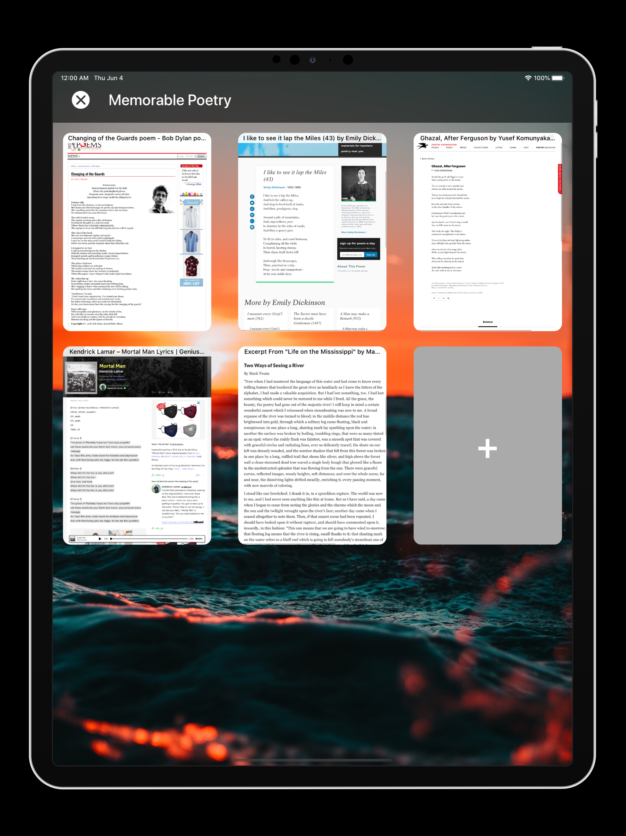
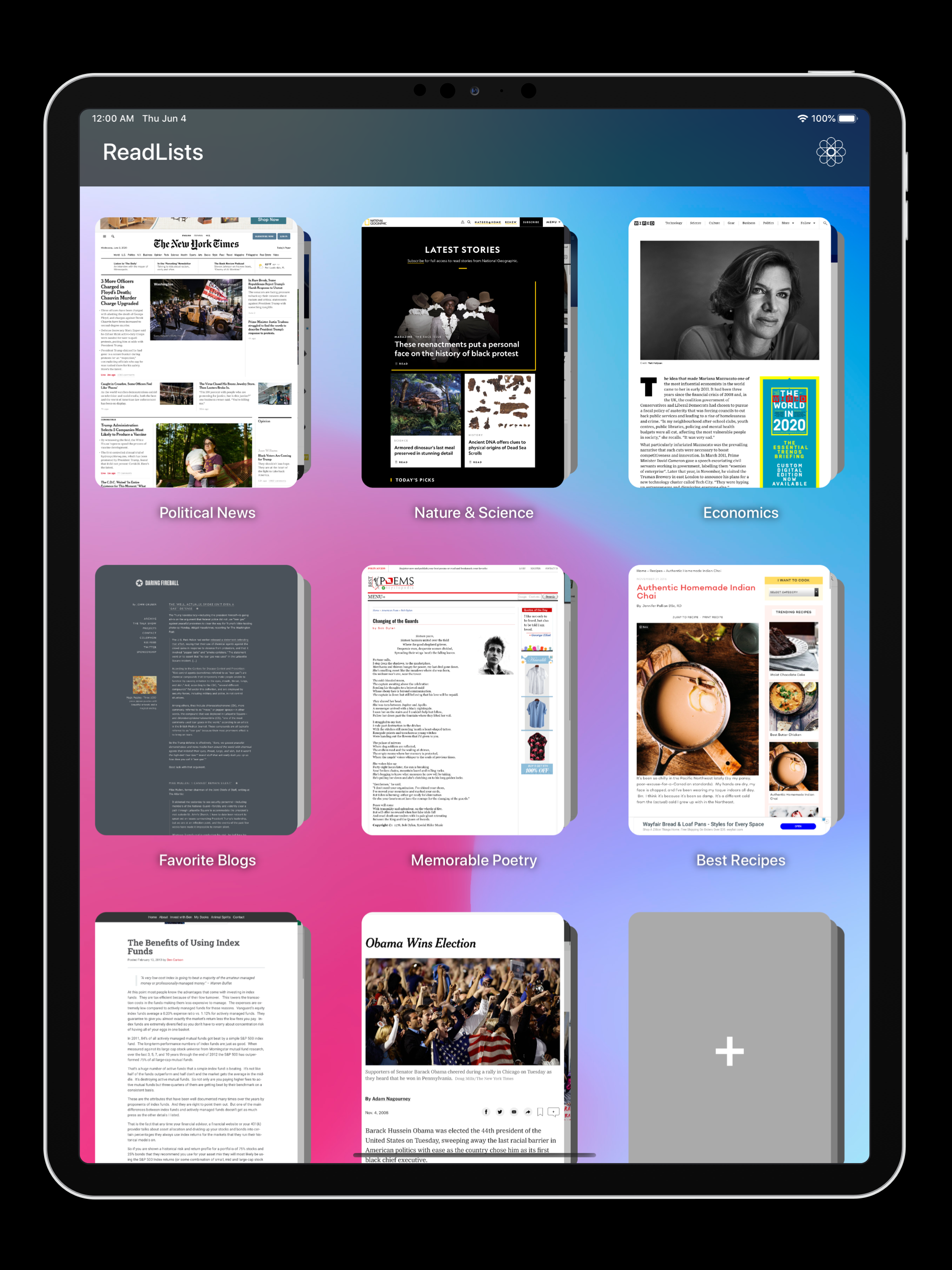
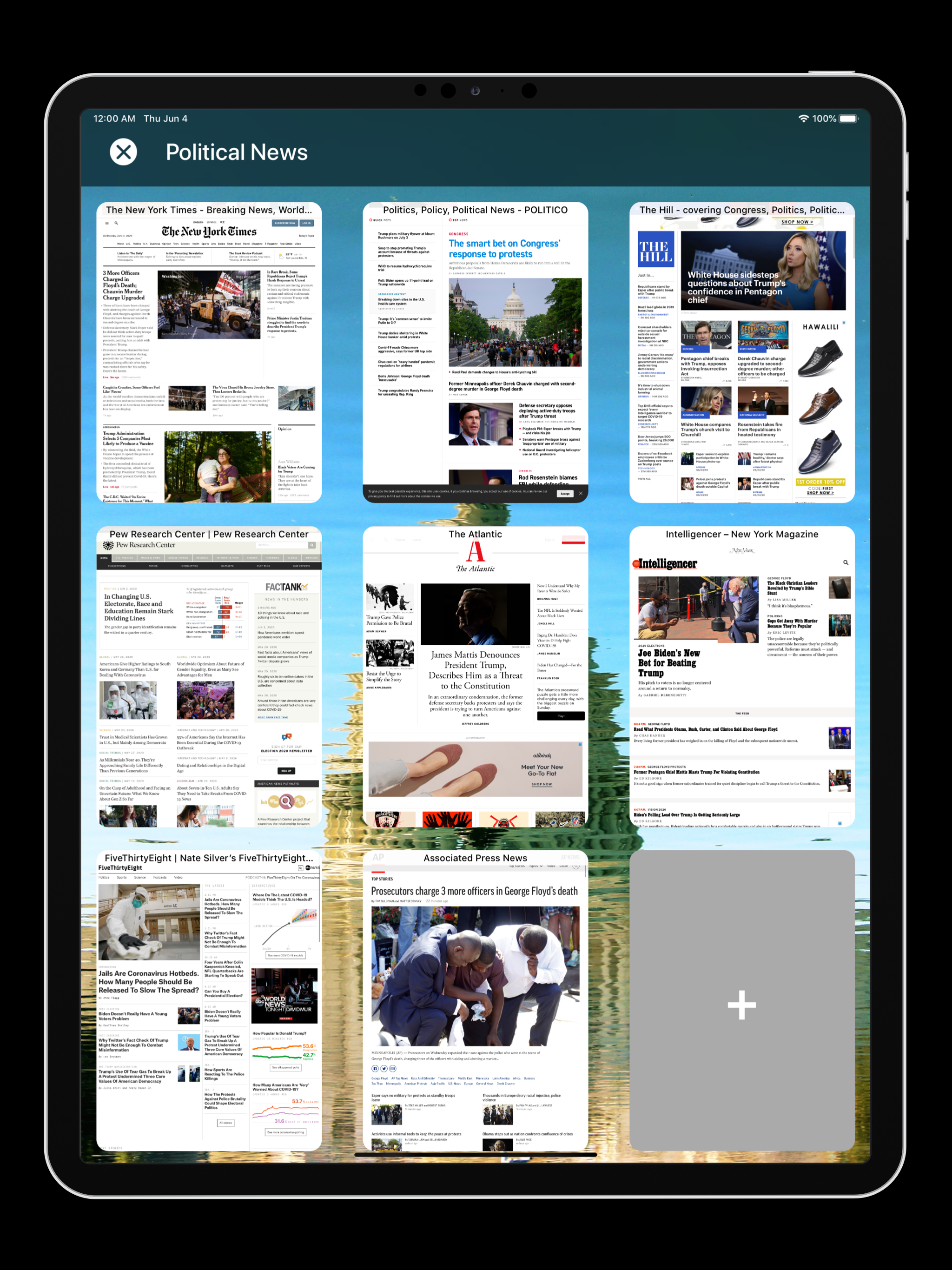
With ReadLists, there is no classic navigation bar system. Using the app feels like you are always on the same ‘view’ the entire time. When the app opens, stacks of webpages, organized by a subtopic, are animated in. Tapping on a stack results in the stack spreading out it’s webpages. Then, if you tap on a webpage within that stack, that webpage will animate out to cover the existing screen. This fluidness allows the user to intuitively understand the app’s mapping and navigation.
These animations also naturally reveal obvious gestures. You can pinch in to ‘peek’ into and select any stack. And you can pinch into a webpage to expand it. The reverse is also true. Once on a webpage that covers the entire screen, simply pinch out to go back to the stack view. And then, pinch out again to re-stack this folder and view other stacks.
The animations are also dynamic when the gestures are used. We compute the acceleration of pinches to then dictate what the timing curve of the animation will look like once the user exits the pinch gesture. This makes the UI feel very natural, playful, and fun to use.
The best onboarding experience is no onboarding experience
When you first open a new app, you’re usually greeted with a long paginated view of tutorials that bombard you with all the ways the app works and gestures you can use to navigate it. Instead of doing this, you can instantly use ReadLists from the moment you open the app.
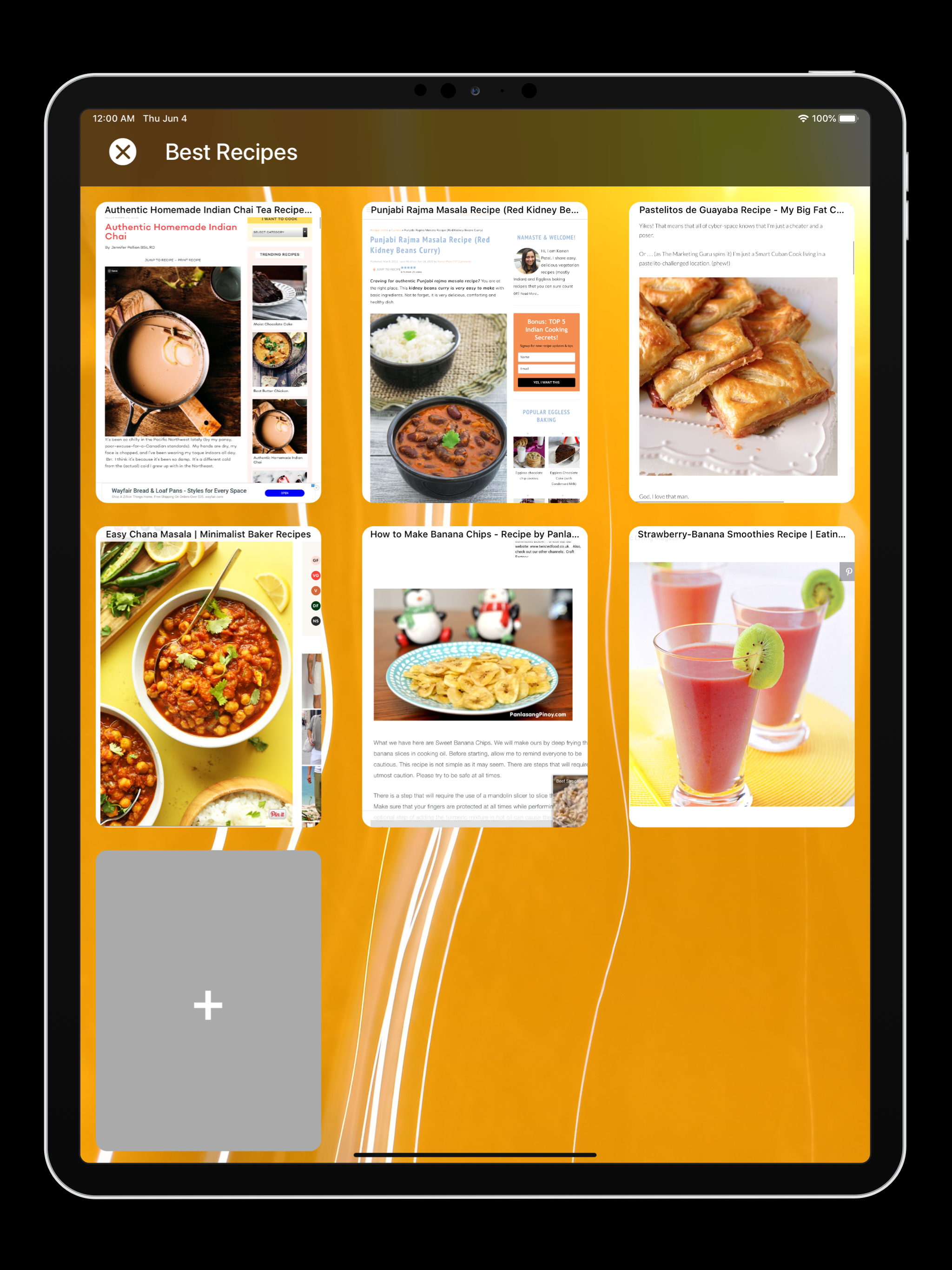
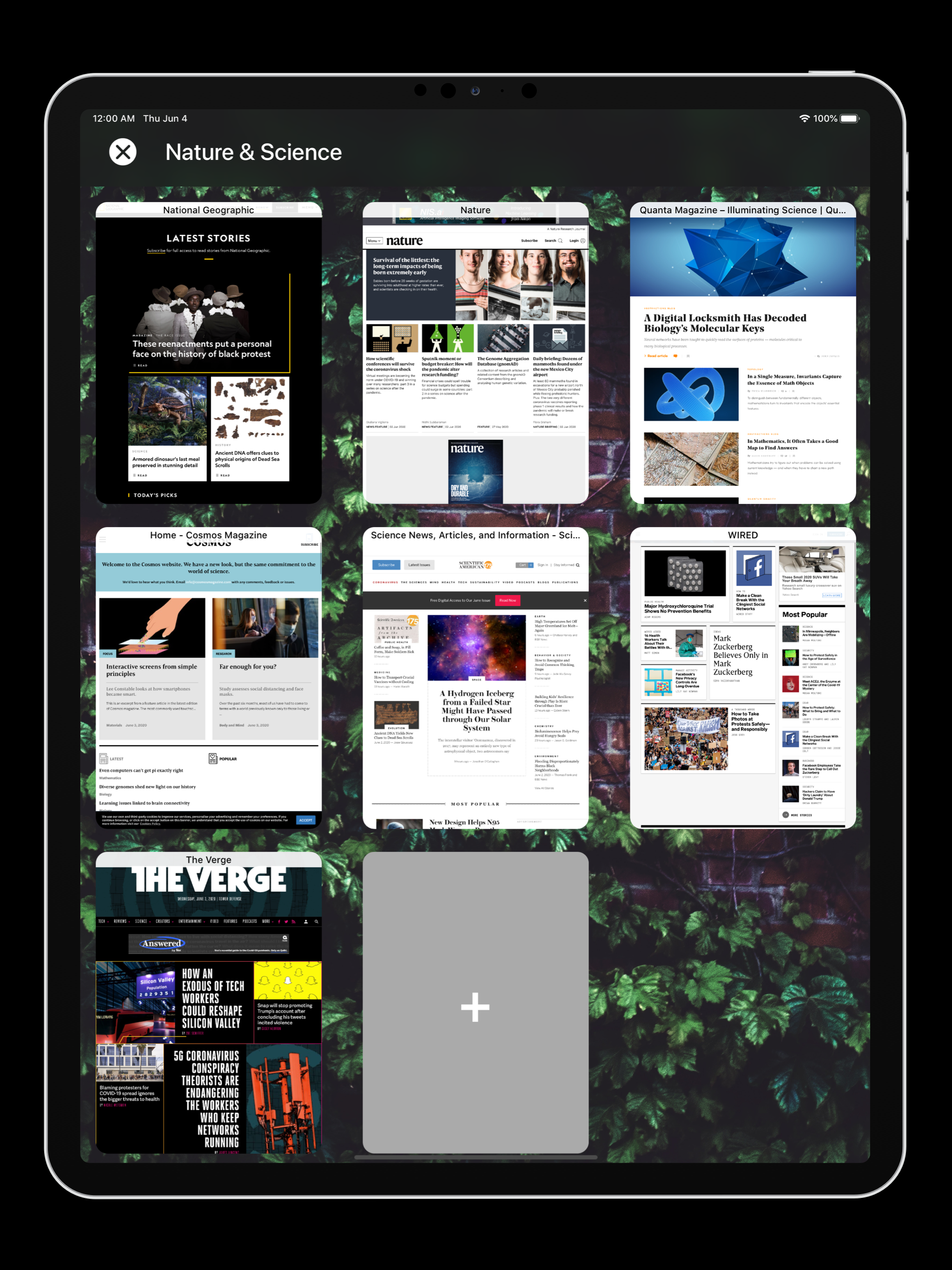
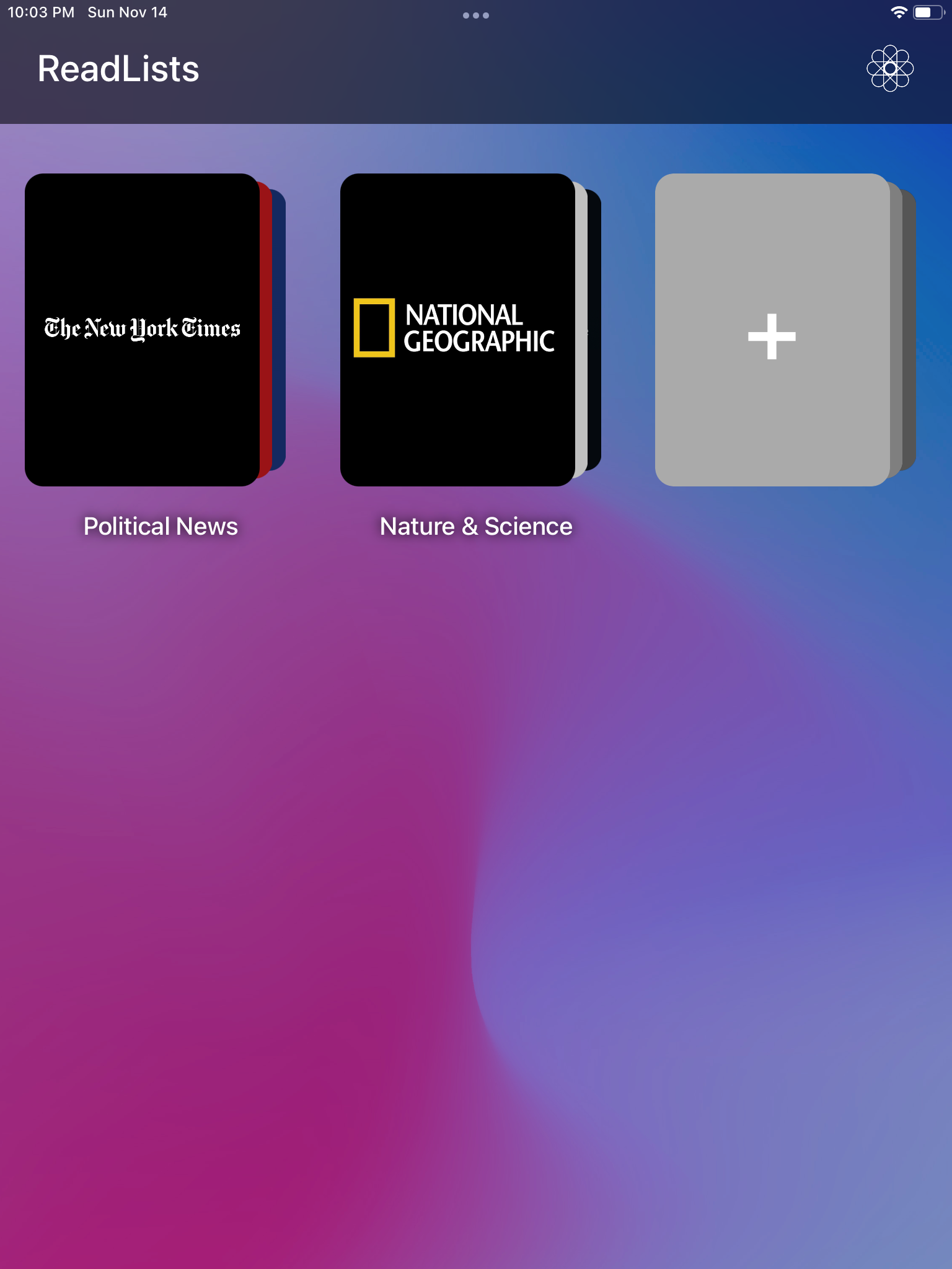
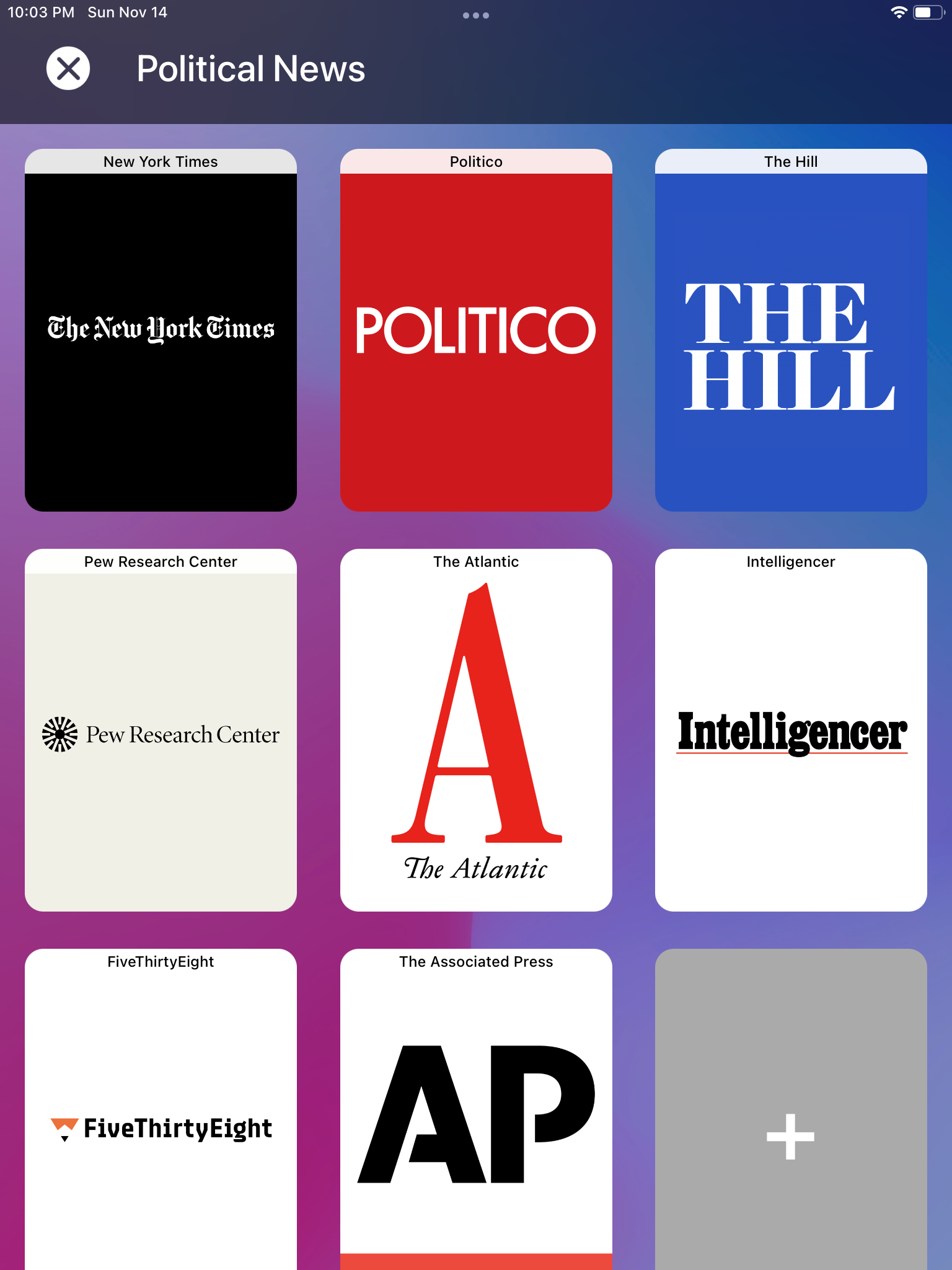
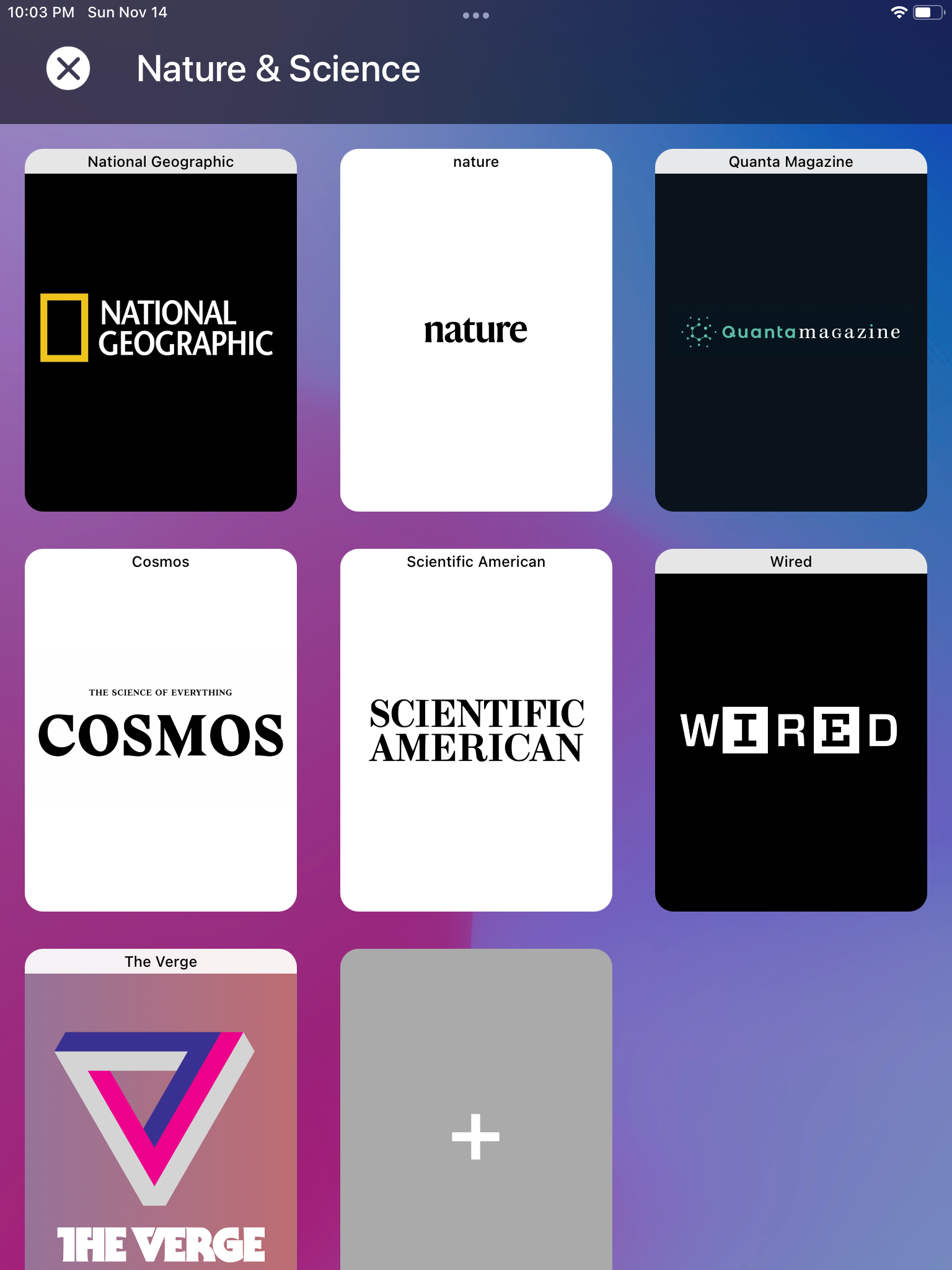
When you first open the app, there’s two pre-curated ReadLists that you can instantly start browsing. And if you don’t use gestures to pinch in/out of the stacks and webpages after a few sessions, then (and only then) ReadLists will eventually present a tip alert that shows you a visual guide on how you can use these gestures for navigation.
By having pre made data and reactive (instead of proactive) tutorials, we let users enjoy and play with the app from the moment they open it. This provides for a more enriching user experience when compared to even the most fanciest onboarding animation!
Well-tested and researched
This app was part of my senior thesis, where I researched and developed methods for preventing the rise of misinformation and filter bubbles in scalable social networks. The thesis included the development of this app, along with over a dozen user studies that evaluated the app’s design. We used an iterative design process that took feedback from users to improve the app’s functionality. Tap here to read the thesis.